

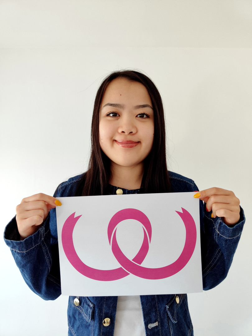

As Witney in Pink celebrates its 25th anniversary supporting Against Breast Cancer, the charity is proudly unveiling a brand-new look designed by local Abingdon & Witney College student Cayla Au.
The refreshed branding, which includes a bold new logo and updated design templates, will make its public debut this weekend at Witney Carnival on Saturday 12th July, where Witney in Pink will join the musical-themed parade in true vibrant style — pink, of course!
As part of a work experience project, graphic design students were invited to re-imagine the Witney in Pink identity. Dozens of creative ideas were submitted, but it was Cayla’s thoughtful and eye-catching logo that captured the spirit of the campaign.
“Work experience for Witney in Pink was an enjoyable experience for me as it has enabled me to improve my skills within graphic design,” said Cayla. “Initially I didn’t have much knowledge in producing a logo which effectively reflects a charitable cause. But this process helped me refine my creative skills in conveying a meaningful message. I’m really pleased to have taken part — and proud that my designs will help raise awareness of such an important cause.”
Her design features a re imagined pink ribbon — the universal symbol of breast cancer awareness — which curves into a "W" to represent Witney, while also echoing the natural shape of the female form.
“It’s been a joy working with Abingdon & Witney College,” said Jeanne Chattoe BEM and founder of Witney in Pink. “Every student brought their own creativity, but Cayla’s design stood out for its elegance, symbolism, and originality. It’s the perfect way to celebrate 25 years of community fundraising and awareness.”
Visitors to Witney Carnival will be among the first to see the new branding in action on the backs of their pink costumes, honouring the past and looking to the future.